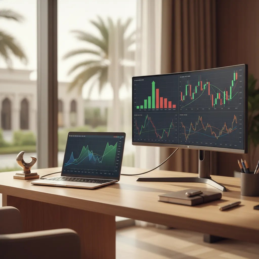
Forex charts are one of the first tools every trader needs to understand. They show how a currency pair has moved over time, which helps you spot trends, identify possible entry and exit points, and avoid trading blindly. For beginners in the UAE, learning chart basics is often a better starting point than jumping straight into strategy. If you are completely new to markets, our trading for beginners guide gives useful context before you start reading live price action. This article explains the main forex chart types, how price is displayed, what timeframes mean, and how traders typically interpret movement. The goal is not to promise better results, but to help you build a clearer foundation before risking capital.
What Forex Charts Show
A forex chart is a visual record of how the price of one currency pair changes over time. If you look at EUR/USD, for example, the chart shows how many U.S. dollars are needed to buy one euro, and how that value rises or falls during the selected period.
Every chart has two basic dimensions. The vertical axis shows price. The horizontal axis shows time. That sounds simple, but the way the chart presents price can vary a lot depending on the chart view you choose.
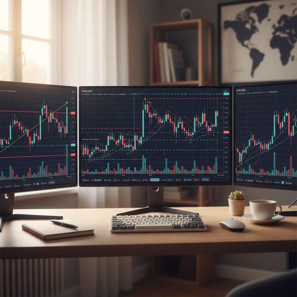
Most trading platforms and broker apps offer several views, including line, bar, and candlestick. Tools such as TradingView have made chart reading more accessible for retail traders, especially those who want clearer visual layouts and drawing tools. If you want a platform-focused explanation, see our tradingview guide.
At Business24-7, we generally encourage beginners to treat chart reading as a skill, not a prediction machine. Charts can help you organize market information, but they do not remove risk. Price can move sharply on economic releases, geopolitical news, or low-liquidity conditions, especially in leveraged forex trading.
Main Chart Types
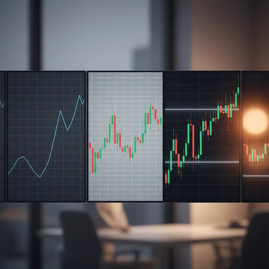
There are three chart types beginners should know first: the line chart, the bar chart, and the candlestick chart. Each one shows price differently.
Line chart: A line chart connects closing prices across each time period. This is the simplest chart view and often the easiest place to start. It gives you a clean picture of the general direction of the market without too much detail. If EUR/USD closes slightly higher over several periods, the line slopes upward. The main limitation is that you do not see the full high, low, and opening range for each period.
Bar chart: A bar chart provides more information. Each bar shows the opening price, the high, the low, and the closing price for the selected timeframe. The left tick marks the open, and the right tick marks the close. This gives more detail than a line chart, but many beginners find it less intuitive at first glance.
Candlestick chart: A candlestick chart shows the same core data as a bar chart, but in a more visual format. The body of the candle shows the distance between the opening and closing price, while the wicks show the high and low. Many traders prefer candlesticks because they make momentum, rejection, and short-term sentiment easier to spot. If you want to go deeper into formations, our guide to candlestick patterns is the natural next step.
For most beginners, candlesticks become the default choice because they balance detail and readability better than bars while offering more context than a line chart.
How to Read Price Movement on a Chart
Reading price charts starts with identifying whether the market is moving up, down, or sideways. An uptrend usually forms a series of higher highs and higher lows. A downtrend usually forms lower highs and lower lows. A sideways market tends to move within a range without a clear trend.
On a candlestick chart, a bullish candle closes above its open, while a bearish candle closes below its open. A series of strong bullish candles may suggest buying pressure, but it does not guarantee continuation. In the same way, long upper or lower wicks can suggest rejection of higher or lower prices.
Beginners should also learn to mark key price zones rather than focusing only on one candle. This is where support and resistance becomes useful. Support is an area where price has historically found buying interest. Resistance is an area where selling pressure has often appeared. These zones can help give structure to chart analysis.
As a rule, avoid reading a single candle in isolation. Price action makes more sense when viewed in context, including trend direction, nearby levels, volatility, and the timeframe you are using.
Common Forex Chart Patterns Beginners Should Recognize
Once you can tell whether price is trending or ranging, the next step is recognizing a few common behaviors that show up on most forex charts. Here is the thing: patterns are not magic signals. Think of them as a visual shorthand for what you already learned above, higher highs and lows, support and resistance zones, and wick rejection.
Trendline breaks: In an uptrend, traders often connect rising lows with a trendline to visualize structure. A clean break below that line can signal weakening momentum or a shift into a range. In a downtrend, the same idea applies with falling highs. From a practical standpoint, it is usually safer to wait for a candle to close beyond the trendline on your chosen timeframe, rather than reacting to an intrabar spike.
Channels: A channel is a trend that moves between two roughly parallel boundaries. Price may bounce between the upper and lower edge as it trends. Many people overlook that channels are still trends, not ranges. A channel can break, but until it does, repeated reactions at the boundaries often matter more than trying to predict the exact turning point.
Double top and double bottom: These form when price tests a similar high twice (double top) or a similar low twice (double bottom). Beginners often interpret them as automatic reversal patterns, but context is what makes them useful. A double top near a clear resistance zone can be more meaningful than a double top that forms in the middle of nowhere.
Consolidation and ranges: Sideways movement is common in forex. You will often see price compress into a tight band, then expand again. Ranges can be easier to trade conceptually, but they can also produce false breakouts, especially when volatility is low and liquidity thins out. This is where marking zones instead of single lines can help, because price often overshoots before returning back into the range.
The reality is that patterns fail. A breakout can reverse, a trendline can snap back, and a range can expand without warning. That is why many traders look for confirmation in the form of a close beyond a level, a clear rejection wick, or alignment across more than one timeframe. None of that removes risk, but it can reduce impulsive decision-making.
Chart Timeframes and Market Context
Timeframes determine how much data each bar or candle represents. On a 5-minute chart, each candle reflects five minutes of price action. On a daily chart, each candle reflects one full trading day. This changes how the same market can appear.
A currency pair may look bullish on a 15-minute chart and bearish on a daily chart at the same time. That is not a contradiction. It just means the market can move differently depending on the window you are studying.
Beginners often make the mistake of jumping into very short timeframes too early. Lower timeframes can look exciting, but they tend to contain more noise and can lead to overtrading. In most cases, it is easier to learn chart structure on higher timeframes such as 1-hour, 4-hour, or daily charts.
If you want to build a stronger foundation, a broader technical analysis guide can help you understand how chart reading fits with trend analysis, indicators, and market structure.
For UAE-based traders, it is also worth remembering that forex is a global market. Volatility may increase around London and New York sessions, major central bank announcements, or U.S. inflation data. Chart analysis works best when combined with awareness of market timing and risk.
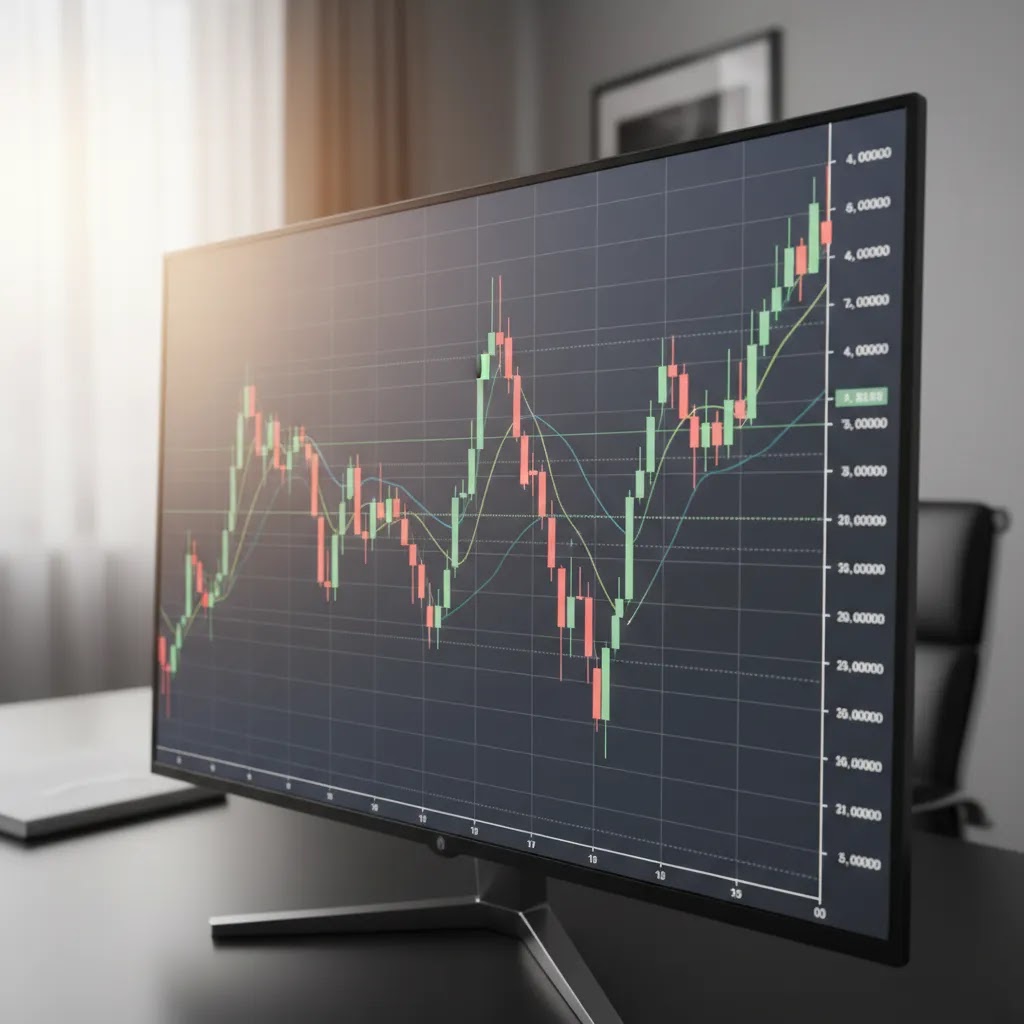
Live Forex Charts, Events, and Why Price Moves Suddenly
A forex live chart can look calm for hours, then suddenly print a large candle with a long wick or a sharp gap in price. Beginners often assume they missed a technical signal, but in many cases the move is event-driven. Some charting tools can overlay economic calendar events or news markers directly on the chart, which helps explain why price accelerated at a specific time.
Consider this: there are times when price movement is mostly structural, meaning it is responding to trend direction, nearby support or resistance, and normal levels of liquidity. Then there are times when price movement is driven by scheduled data or unexpected headlines. A central bank rate decision, a CPI release, or U.S. Non-Farm Payrolls can trigger fast repricing across USD pairs. Even if the broader trend stays intact, the short-term volatility can be significant.
Now, when it comes to what you see on the chart during these moments, two things often change. First, spreads can widen, especially on broker platforms during fast markets, which means the gap between bid and ask may increase. Second, candles can expand quickly because the market is processing new information and liquidity providers are adjusting prices. This can lead to slippage, where your execution price is different from what you expected, particularly if you use market orders.
A practical workflow for beginners is to separate analysis time from event time. If you are learning, it may help to check the economic calendar before you start analyzing, then avoid making snap decisions right as a release hits. Waiting for the candle to close on your timeframe is one simple rule that can reduce overreaction. A 5-minute spike looks very different once a 1-hour candle has finished forming, and reading half-formed candles during a major release can lead to false conclusions.
None of this means you cannot use live charts. It means live charts are most useful when you understand why volatility can appear suddenly. The goal is not to predict the news, but to recognize when the market environment has changed so you can manage risk accordingly.
Pros and Cons
Strengths
- Line charts are simple and useful for spotting broad market direction without too much visual noise.
- Bar charts show the full open, high, low, and close for each period, which gives more detail than a line chart.
- Candlestick charts make short-term momentum and price rejection easier to interpret visually.
- Using multiple timeframes can help traders see both the broader trend and shorter-term setups.
- Forex charts are widely available across most broker platforms and third-party charting tools.
Considerations
- Charts do not predict the future and may give misleading signals during news events or low-liquidity periods.
- Beginners can overcomplicate chart analysis by adding too many indicators or switching timeframes constantly.
- Very short timeframes often contain market noise, which can make decision-making harder for new traders.
- Reading candlesticks well takes practice, especially when trying to interpret them within trend and level context.
Who Should Use Which Chart?
Line charts usually suit complete beginners who just want to understand whether price is generally rising or falling. Bar charts may suit learners who want full price data and do not mind a less visual layout. Candlestick charts are often the best fit for most retail traders because they offer detail without becoming too hard to read.
If you are just starting out, begin with line charts to understand direction, then move to candlesticks once you are comfortable with opens, closes, highs, and lows. Traders who plan to study patterns, zones, and momentum will usually spend most of their time on candlestick charts.
How to Start Reading Forex Charts
Start with one currency pair, one chart type, and one or two timeframes. That approach is usually more effective than trying to monitor everything at once.
First, open a clean chart and identify the pair, such as EUR/USD or GBP/USD. Second, switch between line, bar, and candlestick views so you can see how each presents the same information. Third, choose a higher timeframe like 1-hour or 4-hour and mark obvious swing highs and lows. Fourth, look for whether price is trending or ranging. Fifth, add simple levels where price has reacted before.
Many beginners benefit from practicing in a demo environment before using real funds. Business24-7 covers broker and platform options for UAE traders in our Trading Fundamentals and Technical Analysis sections, where you can continue building core skills before making platform decisions.
Indicators on Forex Live Charts: What to Use First (and What to Avoid)
Many live forex charts allow you to add indicators, which are calculations applied to price data to help you interpret trend, momentum, or volatility. Here is the thing: indicators can support your chart reading, but they do not replace it. If you do not understand market structure, an indicator will not magically fix that, it will usually just add more signals to interpret.
From a practical standpoint, beginners often do better with a minimal set rather than stacking five or ten tools on one chart. Too many indicators can create conflicting information, especially when you switch timeframes. An indicator that looks bullish on a 15-minute chart can look neutral or bearish on a 4-hour chart, because the input data is different.
If you want a simple starting point, many new traders begin with one trend tool and one momentum tool:
- Moving averages: A moving average smooths price over a chosen period, which can make the direction of the trend easier to see. It is often used as a visual guide rather than a precise buy or sell trigger.
- RSI: The Relative Strength Index is a momentum indicator that measures the speed of recent price changes. Beginners often use it to spot when momentum is stretched, but it can stay elevated or depressed for long periods in strong trends.
What many people overlook is that indicator settings are not universal. A 14-period RSI on a 5-minute chart behaves differently than a 14-period RSI on a daily chart. The same applies to moving averages. That is why testing in a demo environment can help you understand how an indicator behaves before you rely on it in live conditions.
A final caution is to avoid treating indicators as certainty, especially during major economic releases. Volatility can distort signals, spreads can widen, and fast candles can make oscillators swing rapidly. If you keep your charts clean and use indicators as supporting evidence, you are less likely to get pulled into reactive trading decisions.
Frequently Asked Questions
What is the easiest forex chart type for beginners?
The line chart is usually the easiest starting point because it only connects closing prices. That makes the overall direction easier to see. Once you understand how price moves over time, most beginners move on to candlestick charts because they offer more detail without becoming too difficult to read.
Are candlestick charts better than line charts?
They are not always better for every purpose, but they usually offer more useful information. Candlesticks show the open, high, low, and close for each period, which helps traders understand momentum and rejection. Line charts are still useful for quickly viewing long-term direction with less clutter.
How do I know if a forex chart is in an uptrend?
A market is generally considered to be in an uptrend when it forms higher highs and higher lows over time. This means price is making progress upward even after pullbacks. It helps to check more than one timeframe so you do not mistake a short-term bounce for a broader trend change.
What timeframe should beginners use for forex charts?
Many beginners find 1-hour, 4-hour, and daily charts easier to read than very short timeframes. These charts tend to reduce market noise and make overall structure clearer. Lower timeframes like 1-minute or 5-minute can be harder to interpret and may encourage impulsive trading decisions.
Can I use chart analysis alone to trade forex?
You can use chart analysis as part of your approach, but relying on it alone has limitations. Economic news, volatility, and liquidity can all affect price behavior. Many traders combine chart reading with risk management, awareness of scheduled events, and a clear plan for entries, exits, and position size.
What is a forex live chart?
A forex live chart updates in real time as prices change in the market. It allows traders to monitor current price action instead of only looking at historical data. Live charts can be useful, but beginners should avoid reacting to every small move and should focus on structure rather than constant motion.
Do forex charts work the same on all platforms?
The basic price data is generally similar, but chart tools, layouts, and available indicators may differ between platforms. Some broker apps offer simple charting, while dedicated tools provide more advanced drawing and analysis features. The chart reading principles stay broadly the same even if the interface changes.
Is chart reading enough to make forex trading safe?
No. Chart reading can improve how you interpret market behavior, but it does not make trading safe or predictable. Forex and CFD trading carry substantial risk, especially when leverage is involved. Beginners should use careful risk controls and only trade with money they can afford to lose.
Which chart is best for forex trading?
For many retail traders, the candlestick chart is the most practical option because it shows open, high, low, and close in a format that is easy to scan. Line charts can be useful for quick trend direction, while bar charts provide the same data as candlesticks but can be harder to read for beginners. The best choice depends on what you are trying to see, but most beginners end up using candlesticks for day-to-day chart analysis.
What is the 5-3-1 rule in forex?
The 5-3-1 rule is a common learning framework used by some traders to reduce overload. It typically refers to focusing on 5 currency pairs, using 3 strategies or setups, and trading during 1 session. The exact definition can vary, but the main idea is consistent: limit your variables so you can develop skill and track results more clearly, rather than jumping between too many markets and methods.
Is it possible to make $1000 a day in forex?
It is possible for some traders to have days with large gains, but it is not something you should expect or treat as a realistic daily target, especially as a beginner. Forex trading results vary widely based on strategy, position sizing, market conditions, and costs like spreads and slippage. The reality is that forex and CFD trading involve significant risk, and losses are common, particularly when leverage is used.
Can chatgpt predict forex?
No tool can reliably predict forex markets. ChatGPT can help explain concepts, summarize information, or help you structure a learning plan, but it does not have guaranteed real-time market awareness and cannot account for sudden shifts in liquidity, news, or institutional order flow. If you use AI tools at all, treat them as educational support, not as a signal service, and always consider risk management first.
Key Takeaways
- Forex charts show how a currency pair’s price changes over time.
- Line, bar, and candlestick charts each present price differently, with candlesticks often offering the best balance for beginners.
- Trend direction, support and resistance, and timeframe selection all affect how charts should be interpreted.
- Higher timeframes may be easier for new traders because they reduce short-term noise.
- Chart reading is a foundational skill, not a guarantee of trading success or safety.
Conclusion
Learning to read forex charts is one of the most useful first steps a beginner can take. It helps you understand market structure, recognize trend direction, and read price behavior with more confidence. For most people, the best progression is simple: start with line charts, move to candlesticks, then add concepts like support, resistance, and timeframe analysis. That gives you a practical foundation without overwhelming you early on. Business24-7 focuses on helping UAE readers evaluate trading concepts and platforms with clarity, especially where safety, regulation, and cost matter. If you want to keep building your knowledge, explore our related technical analysis and beginner trading resources before risking real capital.
This article is for informational purposes only and does not constitute personalized financial or investment advice. Forex and CFD trading involve significant risk, and capital is at risk. In leveraged products, losses may exceed deposits where applicable. If you are trading from the UAE, you should consider whether a platform is regulated by a relevant authority such as the Securities and Commodities Authority (SCA) or the Dubai Financial Services Authority (DFSA), and assess whether the product is appropriate for your risk tolerance and financial situation.
Disclaimer
eToro is a multi-asset platform which offers both investing in stocks and cryptoassets, as well as trading CFDs.
Please note that CFDs are complex instruments and come with a high risk of losing money rapidly due to leverage. 61% of retail investor accounts lose money when trading CFDs with this provider. You should consider whether you understand how CFDs work, and whether you can afford to take the high risk of losing your money
This communication is intended for information and educational purposes only and should not be considered investment advice or investment recommendation. Past performance is not an indication of future results.
Copy Trading does not amount to investment advice. The value of your investments may go up or down. Your capital is at risk.
Crypto assets are complex and carry a high risk of volatility and loss. Trading or investing in crypto assets may not be suitable for all investors. Take 2 mins to learn more
eToro USA LLC does not offer CFDs and makes no representation and assumes no liability as to the accuracy or completeness of the content of this publication, which has been prepared by our partner utilizing publicly available non-entity specific information about eToro.
Forex charts are one of the first tools every trader needs to understand. They show how a currency pair has moved over time, which helps you spot trends, identify possible entry and exit points, and avoid trading blindly. For beginners in the UAE, learning chart basics is often a better starting point than jumping straight into strategy. If you are…